composition

The Demonstration Painting

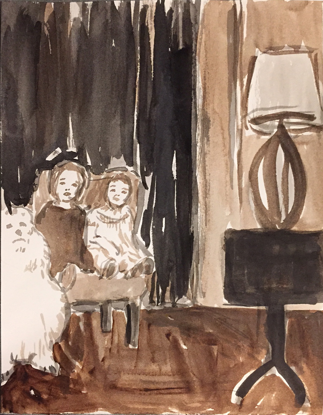
I have a myriad of strange, unloved paintings shoved into various corners my studio that I’ll never actually exhibit but I can’t bring myself to throw out, either. They are all the paintings I made in front of classes I was teaching, in order to demonstrate a particular technique, to participate in whatever sadistic exercise I’d dreamed up for them to do, or just to pass the time while the students worked things out on their own. One of the many things I love about teaching art is that I get to draw and paint for the sake of modelling a process, with no requirement that the end result qualify as capital-A Art. That is a luxury, maybe even a necessity, for a professional artist with an established body of work and style and market. The pressures to produce more capital-A art can sometimes hinder my experimentation and risk. I get paid to teach, and so if teaching requires me to make quick decisions and wacky compositions, I can harness that relentless work ethic in the service of making pointless, but totally necessary, quick and dirty and weird paintings.

The images above and below are results of an exercise in which I require students to choose two disparate images, then divide their picture plane in half unequally, and compose the two into some kind of coherent whole. The source material for the one above was stolen from art history: Van Gogh’s boots crowding out Vermeer’s Music Lesson as if in a cinematic “wipe.” I found a common formal element in the tile floors and ran with it. Limiting my palette to the same three primaries on both sides helps tie it together as well. It is also acrylic, which I don’t own very much of, and which dries quickly and fosters immediacy.

airplanepears

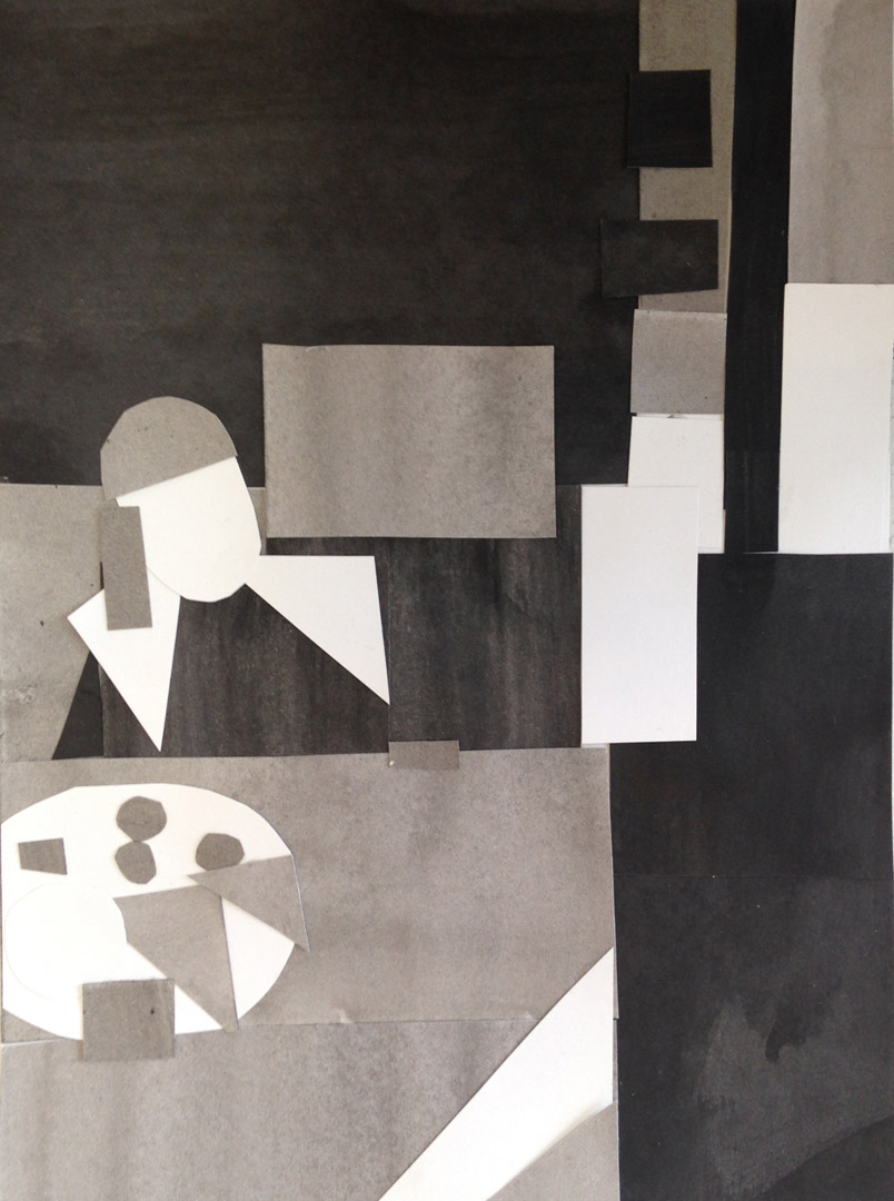
The second one is a bit odder, possibly because it’s source material is more random. Many years ago I found a set of a couple of hundred photo cards, called the “All Purpose Photo Library,” in a thrift store. The box sat around for a long time and survived several studio moves before I finally found a purpose for it. Its original function appears to have been as some sort of elementary-school learning tool; holding up the pictures would apparently provoke meaningful discussions amongst the youngsters about communities, homes, transportation, professions, musical instruments, extension cords, plastic containers of generic cottage cheese, and the like. The set is divided with little index tabs into categories such as “food,” “inside home,” “outside home,” “land animals,” “insects” –  which pretty much covers the known universe. The photos are seriously low-budget affairs dating from the late 1970’s. It looks as though on certain days a professional seamless backdrop was scored for the shoot; other days they had to make due with posing a lemon on a paper Chinet plate. In other words they are pretty much perfect, just have the students blindly choose two of them and then make a painting out of it. Ego investment, overthinking, preconceived notions about high versus low – poof! GONE!

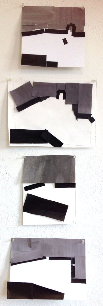
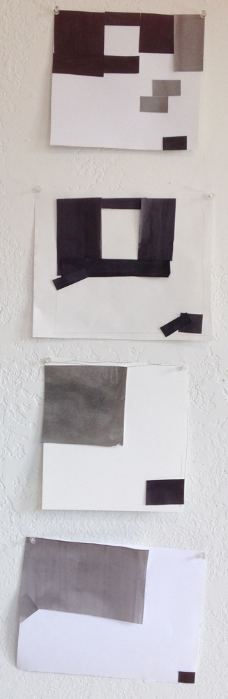
In a related exercise, I had everyone bring in a bunch of magazines, from which we made collages, which then became the basis for paintings. I’ve since lost the collage for this one, but I appear to have made a handy unisex bathroom sign should the need for one arise.

manwomanlegs

I also have a fondness for simple still lives, which I would never take the time for in “real life”. But it’s really great to just PAINT sometimes, not worrying about the “Art” part of it; I remember why I do it in the first place. These are from “Color Boot Camp” demonstrations of limited palettes. The first was from a Saturday afternoon quick demo at the Bellevue Art Museum years ago. Space and time were both limited, so I grabbed a bone from my bone collection and four tubes of paint, showed up, and painted it in front of a group of random strangers, making up the blue background on the spot.

boneHere a lime and a paper bag were the props on hand. (It’s harder than you’d think to match the color of a paper bag.)

lime

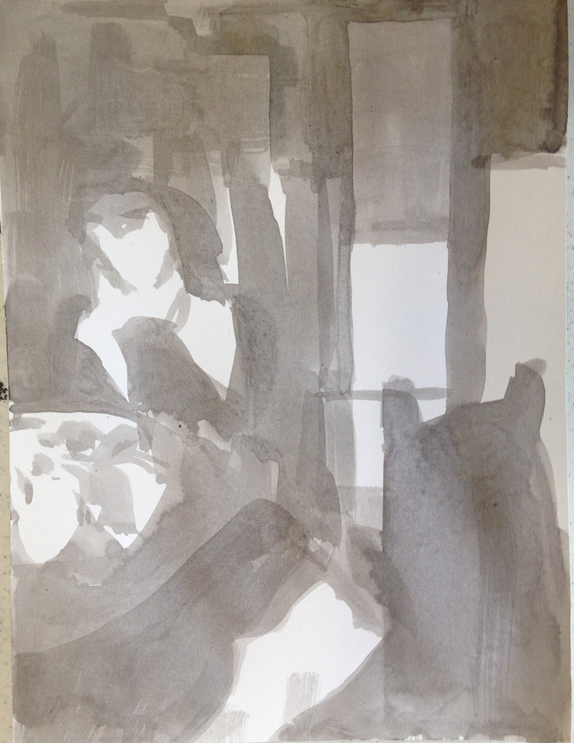
My favorite demonstration paintings, however, are the ones that end up reflecting and distilling the true concerns of my real work, anyway. I paint people all the time – slowly and from photographic sources and in great detail, sometimes hiring a model for a missing part of the pose, and working carefully around the edges of the fabrics I paint on – but when I’m teaching a figure painting class I can work loosely and quickly, making fast decisions about color and composition and not worrying about the edges.

I borrowed a gumball machine from one of my studio neighbors, hung up a striped sheet, added some furniture, a mirror,  and a telephone, hired Ruth, and asked my class to make a narrative out of it. Or not.

gumballmachine

At Pratt many years ago I taught a class called Pattern, Rhythm, and Pictorial Space. This painting I did of Megan in their sun-filled classroom – a former Wonder Bread factory outlet store – is one I like to pull out and look at for inspiration sometimes.

pattern2Most of the fabrics I used in the set-up have since disappeared into paintings.

In the same class, I organized a “still-life potluck”, in which everyone brought patterned objects from home, all of which I arranged into a cacophonous still life. Always thrifty about the materials for these throwaway paintings (which never seem to get thrown away), I painted this on an old piece of mdf that was once part of a floor in a play at ACT Theatre.

pattern

WTF: Learn to Draw Horses!

I grew up with five older siblings. We had around the house lots of books and toys from eras past, representing the accumulated passing interests of a slew of children. I never knew where most of the stuff came from or to whom it originally belonged. It was just there. Of these random vintage possessions, the most influential on my development were two books by Walter T. Foster (1891-1981), “How to Draw” and “How to Draw Horses”.  My cousin and I spent hours on end with the horse book, first copying the drawings, and then using his method of constructing the animal out of ovals, boxes, and lines (which also happened to be WTF’s method for drawing grapes, humans, landscapes, and most of the visible world).

wtfhorsemethodwaltertfostergrapes

These kinds of how-to books are a remnant of a time in America when leisure time was newly accessible to a wider demographic (thanks, labor movement) and their proliferation testament to the new consumer hobby market publishers sought to tap. Most of the authors were successful commercial illustrators and admen pitching their foolproof, easy methods to a public with time on their hands and an admirable wish to better themselves, for fun or profit or both. Unlike similar ventures into this market, for instance, paint-by-number, these books actually taught you a skill, and could be a starting point for a budding serious artist who found them lying around the house. They vary widely in their usefulness, production values, and applicability to fine art, but they all share an insistence that ANYONE CAN LEARN TO DRAW!

These are a few from my present-day collection.

carlsonicandraw funwithapencil getinthereandpaint coverhowtodrawhorses

Walter T. Foster was possibly the most prolific of the bunch, and he was more geared toward realism than those who were riding the comic book wave of the 1940’s and 50’s. He began his own publishing company, Walter T. Foster Publishing, which produced other artists’ how-to books as well as his own. Possibly one reason he could be so prolific can be found in the off-the-cuff, sketchbook quality of his books. They are full of bits of advice, hand-written in pencil, that usually, but not always, correspond to the illustrations, as if he just remembered something important and had to write it in the interstices of the drawings before it slipped his mind. Sometimes the drawings run right off the page. Possibly they are just his sketchbooks, barely edited and annotated.

arm

He’s full of advice and encouragement. In the example above he is mighty specific about the exact size of drawing board you should use, as well as where you should lean it. Elsewhere, after laying out the 1/3 rule of composition, he exhorts:

Don’t hold to any cut-and-dried rules. Think for yourself and apply what you learn from all sources.

On drawing a vase of flowers:

Fine, go ahead, but if you have trouble just know it isn’t an easy thing to do.

Many of his snippets of wisdom are indeed signed “W.T.F.”

Here’s a helpful, if confusing, hint on the pitfalls in composition, which also looks like a recipe for a successful cubist painting:
waltertcomposition

The irrepressible Andrew Loomis, author of “Fun With A Pencil”, mixes instructions for drawing cartoon caricatures right in more with realistic figures and perspective theory. His formulas are rather more formulaic, but he also proves a pleasant companion for your drawing journey. “Never mind if they are a little off” is timeless advice for learning any new skill, and people particularly need to hear it when they’re drawing, since the disastrous results of early attempts are always staring you in the face.

loomisblookball

This chart of standard facial measurements is from 1939, so we’ll cut him some slack on his ethnocentricity, of which, trust me, this is a more mild example:

loomisheads

The ideal American is not only white, chiseled, and afflicted with lines all over their face, but is also possibly transgender. Note the identical features transposed from Mr. Ideal American to Ms. Ideal American.

Actually, I do hand out a version of that formula to beginning students tackling portraits for the first time. I find it helps them to see what’s in front of them, and usually if not always keeps them from putting the eyes at the very top of the head.  I do add the warning, “actual results may vary,” which one should keep in mind regardless of the subject’s ethnicity.

loomisslicing

I’m not entirely sure what this diagram is supposed to represent. It doesn’t even really make sense internally: why is the brow line perpendicular to the ear line? And, besides, one should NEVER use a real knife to draw another human. While we’re at it, let me also state that real children should never be allowed to play unsupervised with perspective.kidwithballoon

Next to the Ideal American, the most important formula for the budding commercial illustrator to have in their back pocket was the Pretty Girl, the pleasingness of which, according to Loomis, is “99% in how well you draw it”. Incidentally, this validates Jessica Rabbit’s oft-quoted observation that she wasn’t bad, just drawn that way.

loomisprettygirl

Even into the late 1960’s, it was still important to keep those gender roles straight when learning to draw.

boysplayball girlsskiprope

George Carlson, author of “I CAN DRAW!”, from which those were taken, was no Walter T. Foster, but WTF is a valid response to these unhelpful diagrams. This book was aimed at children, but evinces little respect for their ability to distinguish drawing from tracing dotted lines. What is “The head is drawn this way” supposed to mean? Those are two identical pictures, except one is red and one is black with an arrow pointing toward it, but no further instructions.

Mona_Lisa,_by_Leonardo_da_Vinci,_from_C2RMF_retouched

Mona Lisa is painted this way.

Mona Lisa is painted this way.

W.T.F. himself wasn’t immune from the illustrative conventions of his time, either. In his books, men’s hands are to be drawn realistically, while ladies’ hands tend to taper unnaturally.

wtfladieshands

In my experience, drawing a “leaf shape” first has never, ever been helpful in drawing a hand. It is only helpful in drawing a leaf. You can’t argue with this, though:

Hands are not easy to draw and you should devote much time to them.

Unlike the learn-to-draw-in-five-days-and-get-rich school of art instruction, Foster doesn’t sugarcoat the sheer hours and sweat it takes to learn to draw. You can tell he really loved his vocation and wanted to make it accessible to anyone with the inclination. As a child I had the inclination but I didn’t know any artists (or horses for that matter). Doing the exercises in his books gave my initial inclination some focus and direction. Breaking horses down into their component ovals, however formulaic, demystified drawing for me. I started with his horses and grapes, but I kept on drawing while Foster assured me that, although it was bound to be difficult, I could get it with practice. “Do not let it scare you. Just take your time.”

Horse by the author, circa 1970's. Crayon on found office paper.

Horse by the author, circa 1970’s. Crayon on found office paper.

I will give Mr. Foster the last word:

Draw everything you see, it will come in handy when you start making a living at it. Sure you can. Try.

W.T.F.!

Trouble in Florence City

Poor Paolo Uccello (1397-1495). He could have been a contender. According to Giorgio Vasari, Uccello would have been “the most delightful and inventive genius in the history of painting” had he not wasted all his time and talent away on the excessive pursuit of– was it fast women, drink, hard drugs, or gambling?  – no, the worthless undertaking upon which Uccello wasted his life was…Perspective. Perspective ruined poor Paolo’s career and on top of that, “did violence to his nature”, making him “solitary, eccentric, melancholy, and impoverished.”  He had trouble, with a capital T and that rhymes with P which in quattrocento Florence that apparently stood for Perspective.

Now I read this ominous passage in “Lives of the Artists” within the past year. Did I pay any attention to the obviously-well-thought-out advice of Giorgio Vasari, the father of Art History, that had been passed down to me over the ages? Did I heed this wisdom that had survived 500 years of wars, floods, famines, the rise and fall of empires, to appear to me in my native tongue in my own century in cheap, readily-accessible paperback format ?

Of course not. There came a day I found myself working on a painting that had some serious problems. They were the kinds of problems I described in a previous post, Lose the Christian Theme Park. The various parts just weren’t serving the whole.  I was much too attached to these utterly extraneous and unrelated – if individually interesting – parts. The painting was a mess and it needed a total makeover.

ctp4

After changing the colors and patterns of both floor and table, the type and size of the dessert, and the fireplace a dozen or so times EACH, I decided I needed to paint everything out in white except for the chair and the fabric bits, i.e., the lady and the curtains.

ctp3

Once I rid myself of the ceiling and windows, the space of the painting became a blank slate. Almost: the bits of striped curtain, remnants of past choices, were exerting undue influence on my possible choices for the painting’s future. Their angled tops and bottoms still hinted at the old perspective. So they, too, succumbed to the white paint.

ctp1

It became clear to me that since the woman is viewed from above, what she required was a vast and memorable floor that seemed to stretch on forever, like the suburbs in which she lived. I wanted the space of the painting to be believable but slightly dizzying. It needed tiles, the tiles needed to recede precipitously, and they needed vanishing points to approach. Normally I work these problems out in the drawing stage, but this was a remodel. Drawing lines with a ruler pointing toward vanishing points drawn on the wall, my usual method, felt cumbersome and not exact enough. I had a roll of twine lying around so I began laying out the tiles with it, taping the twine to the edges of the painting and pinning it down at the vanishing points.

string2web

Sarah Vowell, in writing about Civil War re-enactors, observed that they all considered anyone less obsessed with authenticity than themselves a poser, and anyone more obsessed than themselves a wingnut. This observation can apply to any undertaking that is difficult, interesting, and/or obscure enough to allow for large quantities of time to be spent, some might say wasted, on it. Vasari placed Uccello firmly in the wingnut category. There was a time when I would have tried to wing the spacing of the tiles, but now I was headed in a dangerously Uccello-like direction. Winging it was for posers.

For you posers out there, the widths of the tiles as they recede in space diminish along lines that all converge on a vanishing point on the horizon line. Those lines are the strings. They meet at two pushpins on a line drawn on the wall slightly below the top edge of the painting, the horizon line, which also corresponds to the viewer’s eye level, which is somewhat above the lady’s eye level since we are looking down on her.

But the tiles are also going to appear shorter as well as narrower as they recede. Here’s where it gets fun. The way to determine how much shorter the tiles should get is to find the midpoint of a sample square. You do that by drawing two lines joining its opposite corners, making an “X” across the tile. The lines meet at the midpoint. If you were looking at a real tile and you actually drew the lines with a sharpie, the midpoint would be a point actually equidistant from the edges.

However, we want the midpoint of the imaginary tile in the imaginary world of the painting. That imaginary midpoint will be slightly closer to the edge of the tile that is supposed to be farther away from us.

The midpoint of two matching tiles is the same as the midpoint of one giant tile the length of two of them together. If you draw a line from one corner through this midpoint-of-them-both, you get to the far end of the second tile.

tilesflat

Which means, in the imaginary world of the painting you can find the depth of the second tile by drawing a line from a near corner of the first tile through the midpoint of the far edge and it will lead you to the far corner of the second tile.

tilesrecede

Then you can draw a line from the near corner of the second tile, through the midpoint of its far edge, and find the end of the third tile, and so on, until you have spent your life making imaginary tile floors that recede into infinity. Vasari might regard you as a wingnut but Uccello would probably dismiss you as a poser.

Here is the finished painting, a world in which even the lines of the hors d’oeurves meet at a vanishing point on the horizon.

Only Suburban has so Many Wife-Saving Features, 2014

Only Suburban has so Many Wife-Saving Features, 2014

As for Vasari and his forecast of gloom, I’ve not yet become solitary, (more) eccentric, melancholy, or even impoverished. Those things could still happen, but I did sell the painting.

A truck stop for fishermen

The University of Washington Drama drawing class wrapped up with a field trip to Fishermen’s Terminal, a moorage for both working and pleasure boats, with restaurants and services for fishermen and -women. We we accompanied by our intrepid and always-dapper model Amanda. Context brings so much life to life drawing, but is inexplicably left out of most figure classes. There is, for one, the light to contend with, changing the color, bouncing around, casting shadows, and reflecting off of water in this particular situation.

drawing

Here is everyone’s first go at tackling the complicated scenery, with its plethora of vertical masts and fenceposts.

panoweb

amandabymeleta

The scale of the boats in relation to the figure also presented interesting composition problems. Less expected was the element of text: Boats have names, and those names are writ large. Artists sometimes freeze up when confronted with text. They go into what used to be called left-brain mode and forget how to draw. Words have a way of obliterating the rest of the drawing. Something about “Ricky K “, however, was so juicy and tempting that most of the students (and I) wanted to tackle it. Those who included it really succeeded in keeping it in its place as a visual element. The drawings hold together, in spite of being so texty.

rickyK

My polka-dotted skirt appears twice in in this peripatetic panoramic photo of the last pose of the year.

pano

Make that second-last pose, since Amanda’s and my coordinated outfits also begged to be documented.

janeamandaweb

Reverse-Engineering the Masters

In the movies, painters tend to be seized by bouts of inspiration at unpredictable intervals, upon which seizure they spontaneously and spasmodically squish paint into a masterpiece. Mike Leigh’s recent film Mr. Turner was no exception. The spastic-inspiration trope is the default mode for films about more Jackson-Pollocky types, of course, but Leigh’s William J. W. Turner was seized by this affliction when he gazed at the sea or the English countryside, naturally. In reality, painting and drawing a landscape is rather difficult, and Hollywood cliches like these are misleading about the mechanics and intentionality of composition that are actually required to make a picture of anything, including abstraction.  It’s too easy to assume that good landscapes come about through some kind of direct channelling of the scenery, making it all the more frustrating when beautiful or interesting scene you see in real life does not make a beautiful or interesting painting on your page. Even landscapes have to be composed by the artist. Composition is the mechanics, or machinery, of a picture. It’s how it directs your eye from here to there, lets in linger in some places, and return to the subjects that the artist wanted to you focus on. In the class that I just wrapped up, Making Your Own Work: Subject and Composition, a group of experienced painters exposed the picture-making machinery of the masters, teased out the separate elements of that machinery, and began to employ those strategies to their own ends.

We began the first few classes with gesture-drawing from art history. Recording what you see in the first minute of looking at a painting tells you a lot about where the artist has directed your eye.

A one-minute gesture drawing of Wyeth's Christina's World in ink and pencil

A one-minute gesture drawing of Wyeth’s Christina’s World in ink and pencil

Gesture drawing of Giotto's Annunciation

Gesture drawing of Giotto’s Annunciation

Your eye tends to look at the largest form first. In order to better see the hierarchy of forms, we broke them down into two tones, grey and white, simplifying shapes, to get a better idea of the overall order and direction in which one views the painting.

Sandy's two-tone interpretation of Vermeer's sleeping maid

Sandy’s two-tone interpretation of Vermeer’s sleeping maid

Vermeer - Girl Asleep

We also made quick five-minute interpretations in black and grey paper cutouts of projected paintings. Here are four different student’s quick collages of Manet’s 1862 Portrait of Jeanne Duval

: manet

And the original…

whitedress

Four interpretations of Andrew Wyeth’s Master Bedroom

wyeth

And the original . . .

Master Bedroom by Andrew Wyeth

Andrew Wyeth proved to be particularly helpful to study for composition. His subjects were deceptively simple, and he mastered the art of editing and simplifying, while working in the style we erroneously call “realistic”, as if it involved copying from nature. Really, nature is a mess, and you have to tame it. (Just ask Mr. Turner.)

Wyeth’s Brown Swiss, which seems to the untrained eye to be a straightforward rendering of a farm house, is actually a feat of engineering.

Wyeth, Brown Swiss, tempera, 1957  Image: Artstor

Wyeth, Brown Swiss, tempera, 1957
Image: Artstor

A photograph of the same spot reveals that the composition didn’t just present itself. The placement of the house just a wee bit from the left edge makes your eye run over there, too, but then jump down to the reflection before you fall off, then hang a right, sending you back into the painting.. The stream as a big, light, horizontal bar across the lower third was a deliberate choice: water can be dark or light depending on when and where you look at it. The reflection of the house didn’t just happen, either: The artist chose it as an element, its presence and shape dependent on where he stood and the time of day he decided to grab it from. The long shadow on the side of the hill under the house is essential, as is eliminating the sky: the long horizontal shapes are ordered by size, and alternate dark/light. Everything in the picture serves the composition. We can’t say the same for the actual site, which is a lot busier. Granted, the evergreen tree apparently wasn’t big enough to block the house when he painted the picture, but if it did I’m sure he would have found a way to make it work.

wyethphoto

Here is a sketch in which he worked out the composition. It’s possible he started with a more literal drawing and just kept blocking out what he didn’t need with ink until the shapes looked right.

wyethsketch

We tried to get inside long-dead artists’ heads and learn their tricks by reverse-engineering a composition. This is one student’s analysis, of shape, value, and directional lines, of The Judgment of Paris by Cranach the Elder:

judgmentparis

Lucas Cranach the Elder - Judgment of Paris

Students took their own subject-matter, in the form of personal or magazine photographs, and inserted them into the structure of the masterwork. Here a Vermeer becomes the armature for a reinterpretation of one student’s old family snapshot.

vermeergreysandygirls

Treasured snapshots are as difficult to work with as nature. You’re usually too close to the subject matter to know why you like it: Is it the figures, the furniture, the faded colors, or just its emotional associations? It’s nearly impossible to know what is worth keeping and what should be discarded in order to get to an interesting, successful painting. Sometimes the accidental nature of the composition, its very awkwardness, is the best part. This exercise was a way to get a bit of objectivity, and license to move reality around to suit the artist’s purpose.

A continuation of Making Your Own Work: Subject and Composition will begin in late April.

New class!

Making Your Own Work: Subject & Composition starts February 18 and will meet in my studio. This class is for painters who are looking to develop their own voice and a consistent body of work, with an emphasis on composition. Through hands-on exercises using ink washes, drawing, and collage, students will analyze the compositional strategies of master works and apply it to their own subject matter. In-class experiments will be followed by the further development of selected projects in paint or other media. There will also be space to critique and discuss other work you might have in progress and the direction and development of your work as a whole. The class will run for six consecutive Wednesdays, in three-hour sessions. Info on registration is here.

wyethsketchgiottosketch

Quick gestural studies of Wyeth and Giotto from last year’s “Digesting the Visual World” class.