Painting

The Demonstration Painting

I have a myriad of strange, unloved paintings shoved into various corners my studio that I’ll never actually exhibit but I can’t bring myself to throw out, either. They are all the paintings I made in front of classes I was teaching, in order to demonstrate a particular technique, to participate in whatever sadistic exercise I’d dreamed up for them to do, or just to pass the time while the students worked things out on their own. One of the many things I love about teaching art is that I get to draw and paint for the sake of modelling a process, with no requirement that the end result qualify as capital-A Art. That is a luxury, maybe even a necessity, for a professional artist with an established body of work and style and market. The pressures to produce more capital-A art can sometimes hinder my experimentation and risk. I get paid to teach, and so if teaching requires me to make quick decisions and wacky compositions, I can harness that relentless work ethic in the service of making pointless, but totally necessary, quick and dirty and weird paintings.

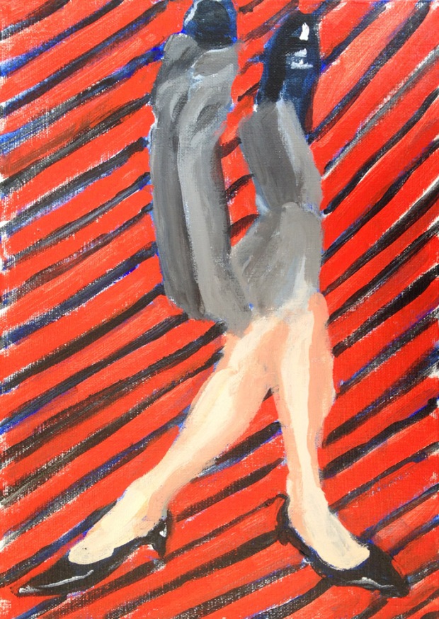
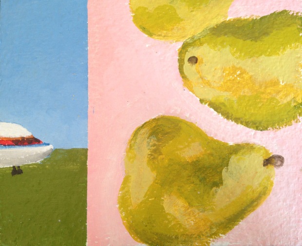
The images above and below are results of an exercise in which I require students to choose two disparate images, then divide their picture plane in half unequally, and compose the two into some kind of coherent whole. The source material for the one above was stolen from art history: Van Gogh’s boots crowding out Vermeer’s Music Lesson as if in a cinematic “wipe.” I found a common formal element in the tile floors and ran with it. Limiting my palette to the same three primaries on both sides helps tie it together as well. It is also acrylic, which I don’t own very much of, and which dries quickly and fosters immediacy.

airplanepears

The second one is a bit odder, possibly because it’s source material is more random. Many years ago I found a set of a couple of hundred photo cards, called the “All Purpose Photo Library,” in a thrift store. The box sat around for a long time and survived several studio moves before I finally found a purpose for it. Its original function appears to have been as some sort of elementary-school learning tool; holding up the pictures would apparently provoke meaningful discussions amongst the youngsters about communities, homes, transportation, professions, musical instruments, extension cords, plastic containers of generic cottage cheese, and the like. The set is divided with little index tabs into categories such as “food,” “inside home,” “outside home,” “land animals,” “insects” –  which pretty much covers the known universe. The photos are seriously low-budget affairs dating from the late 1970’s. It looks as though on certain days a professional seamless backdrop was scored for the shoot; other days they had to make due with posing a lemon on a paper Chinet plate. In other words they are pretty much perfect, just have the students blindly choose two of them and then make a painting out of it. Ego investment, overthinking, preconceived notions about high versus low – poof! GONE!

In a related exercise, I had everyone bring in a bunch of magazines, from which we made collages, which then became the basis for paintings. I’ve since lost the collage for this one, but I appear to have made a handy unisex bathroom sign should the need for one arise.

manwomanlegs

I also have a fondness for simple still lives, which I would never take the time for in “real life”. But it’s really great to just PAINT sometimes, not worrying about the “Art” part of it; I remember why I do it in the first place. These are from “Color Boot Camp” demonstrations of limited palettes. The first was from a Saturday afternoon quick demo at the Bellevue Art Museum years ago. Space and time were both limited, so I grabbed a bone from my bone collection and four tubes of paint, showed up, and painted it in front of a group of random strangers, making up the blue background on the spot.
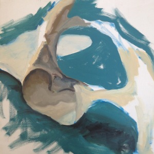
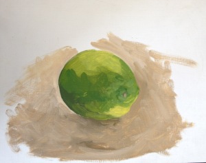
boneHere a lime and a paper bag were the props on hand. (It’s harder than you’d think to match the color of a paper bag.)

lime

My favorite demonstration paintings, however, are the ones that end up reflecting and distilling the true concerns of my real work, anyway. I paint people all the time – slowly and from photographic sources and in great detail, sometimes hiring a model for a missing part of the pose, and working carefully around the edges of the fabrics I paint on – but when I’m teaching a figure painting class I can work loosely and quickly, making fast decisions about color and composition and not worrying about the edges.

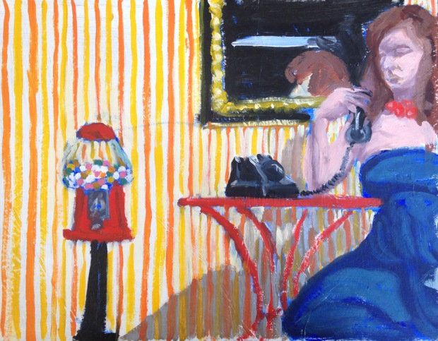
I borrowed a gumball machine from one of my studio neighbors, hung up a striped sheet, added some furniture, a mirror,  and a telephone, hired Ruth, and asked my class to make a narrative out of it. Or not.

gumballmachine

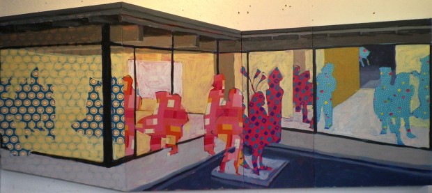
At Pratt many years ago I taught a class called Pattern, Rhythm, and Pictorial Space. This painting I did of Megan in their sun-filled classroom – a former Wonder Bread factory outlet store – is one I like to pull out and look at for inspiration sometimes.
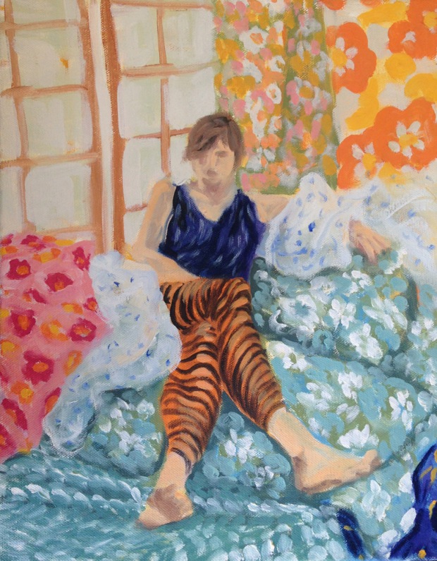
pattern2Most of the fabrics I used in the set-up have since disappeared into paintings.

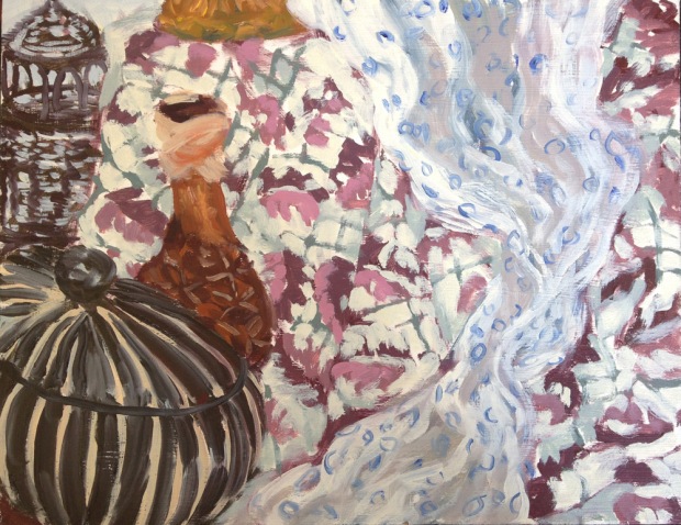
In the same class, I organized a “still-life potluck”, in which everyone brought patterned objects from home, all of which I arranged into a cacophonous still life. Always thrifty about the materials for these throwaway paintings (which never seem to get thrown away), I painted this on an old piece of mdf that was once part of a floor in a play at ACT Theatre.

pattern

Trouble in Florence City

Poor Paolo Uccello (1397-1495). He could have been a contender. According to Giorgio Vasari, Uccello would have been “the most delightful and inventive genius in the history of painting” had he not wasted all his time and talent away on the excessive pursuit of– was it fast women, drink, hard drugs, or gambling?  – no, the worthless undertaking upon which Uccello wasted his life was…Perspective. Perspective ruined poor Paolo’s career and on top of that, “did violence to his nature”, making him “solitary, eccentric, melancholy, and impoverished.”  He had trouble, with a capital T and that rhymes with P which in quattrocento Florence that apparently stood for Perspective.

Now I read this ominous passage in “Lives of the Artists” within the past year. Did I pay any attention to the obviously-well-thought-out advice of Giorgio Vasari, the father of Art History, that had been passed down to me over the ages? Did I heed this wisdom that had survived 500 years of wars, floods, famines, the rise and fall of empires, to appear to me in my native tongue in my own century in cheap, readily-accessible paperback format ?

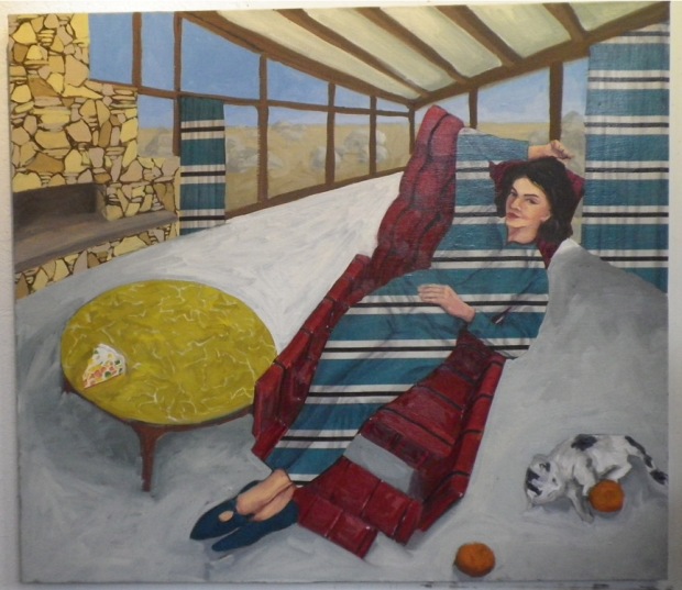
Of course not. There came a day I found myself working on a painting that had some serious problems. They were the kinds of problems I described in a previous post, Lose the Christian Theme Park. The various parts just weren’t serving the whole.  I was much too attached to these utterly extraneous and unrelated – if individually interesting – parts. The painting was a mess and it needed a total makeover.

ctp4

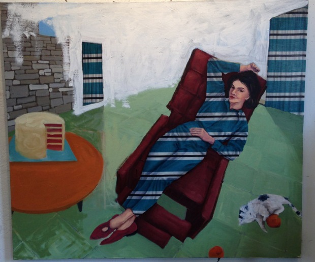
After changing the colors and patterns of both floor and table, the type and size of the dessert, and the fireplace a dozen or so times EACH, I decided I needed to paint everything out in white except for the chair and the fabric bits, i.e., the lady and the curtains.

ctp3

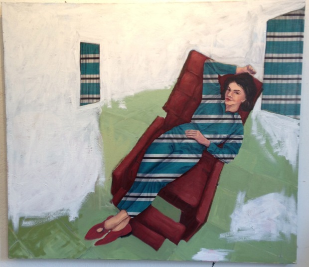
Once I rid myself of the ceiling and windows, the space of the painting became a blank slate. Almost: the bits of striped curtain, remnants of past choices, were exerting undue influence on my possible choices for the painting’s future. Their angled tops and bottoms still hinted at the old perspective. So they, too, succumbed to the white paint.
ctp1

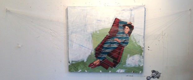
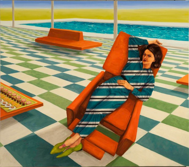
It became clear to me that since the woman is viewed from above, what she required was a vast and memorable floor that seemed to stretch on forever, like the suburbs in which she lived. I wanted the space of the painting to be believable but slightly dizzying. It needed tiles, the tiles needed to recede precipitously, and they needed vanishing points to approach. Normally I work these problems out in the drawing stage, but this was a remodel. Drawing lines with a ruler pointing toward vanishing points drawn on the wall, my usual method, felt cumbersome and not exact enough. I had a roll of twine lying around so I began laying out the tiles with it, taping the twine to the edges of the painting and pinning it down at the vanishing points.

string2web

Sarah Vowell, in writing about Civil War re-enactors, observed that they all considered anyone less obsessed with authenticity than themselves a poser, and anyone more obsessed than themselves a wingnut. This observation can apply to any undertaking that is difficult, interesting, and/or obscure enough to allow for large quantities of time to be spent, some might say wasted, on it. Vasari placed Uccello firmly in the wingnut category. There was a time when I would have tried to wing the spacing of the tiles, but now I was headed in a dangerously Uccello-like direction. Winging it was for posers.

For you posers out there, the widths of the tiles as they recede in space diminish along lines that all converge on a vanishing point on the horizon line. Those lines are the strings. They meet at two pushpins on a line drawn on the wall slightly below the top edge of the painting, the horizon line, which also corresponds to the viewer’s eye level, which is somewhat above the lady’s eye level since we are looking down on her.

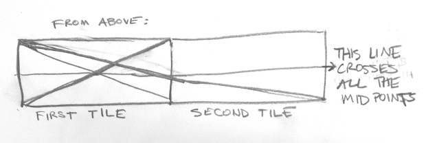
But the tiles are also going to appear shorter as well as narrower as they recede. Here’s where it gets fun. The way to determine how much shorter the tiles should get is to find the midpoint of a sample square. You do that by drawing two lines joining its opposite corners, making an “X” across the tile. The lines meet at the midpoint. If you were looking at a real tile and you actually drew the lines with a sharpie, the midpoint would be a point actually equidistant from the edges.

However, we want the midpoint of the imaginary tile in the imaginary world of the painting. That imaginary midpoint will be slightly closer to the edge of the tile that is supposed to be farther away from us.

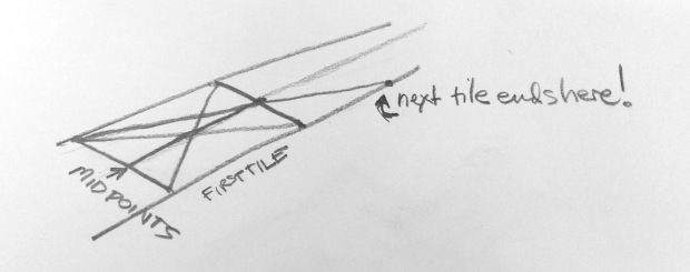
The midpoint of two matching tiles is the same as the midpoint of one giant tile the length of two of them together. If you draw a line from one corner through this midpoint-of-them-both, you get to the far end of the second tile.

tilesflat

Which means, in the imaginary world of the painting you can find the depth of the second tile by drawing a line from a near corner of the first tile through the midpoint of the far edge and it will lead you to the far corner of the second tile.

tilesrecede

Then you can draw a line from the near corner of the second tile, through the midpoint of its far edge, and find the end of the third tile, and so on, until you have spent your life making imaginary tile floors that recede into infinity. Vasari might regard you as a wingnut but Uccello would probably dismiss you as a poser.

Here is the finished painting, a world in which even the lines of the hors d’oeurves meet at a vanishing point on the horizon.

Only Suburban has so Many Wife-Saving Features, 2014

Only Suburban has so Many Wife-Saving Features, 2014

As for Vasari and his forecast of gloom, I’ve not yet become solitary, (more) eccentric, melancholy, or even impoverished. Those things could still happen, but I did sell the painting.

New class!

Making Your Own Work: Subject & Composition starts February 18 and will meet in my studio. This class is for painters who are looking to develop their own voice and a consistent body of work, with an emphasis on composition. Through hands-on exercises using ink washes, drawing, and collage, students will analyze the compositional strategies of master works and apply it to their own subject matter. In-class experiments will be followed by the further development of selected projects in paint or other media. There will also be space to critique and discuss other work you might have in progress and the direction and development of your work as a whole. The class will run for six consecutive Wednesdays, in three-hour sessions. Info on registration is here.

wyethsketchgiottosketch

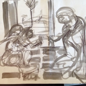
Quick gestural studies of Wyeth and Giotto from last year’s “Digesting the Visual World” class.

Lose the Christian Theme Park!

In the Making Your Own Work class, while we’re looking at people’s work in progress, we continually come back to the question: How much stuff should there be in a painting? Usually the answer is something along the lines of “less than what you have.” Anne likened it to Coco Chanel’s directive to remove one accessory before one leaves the house.

And sometimes the thing you have to remove is your favorite: the one you thought was so utterly brilliant and clever. But it just doesn’t serve the painting, and it needs to be the piece of jewelry you leave on the hall table before you dash out the door.

Many years ago, a friend of mine, Michael Barrish, went on a long bicycle trip intending to visit every town named Freedom, Justice, and Liberty in the contiguous United States. That, while interesting, really has nothing to do with my point. Along the way he visited many old friends, and brought news of them to the subsequently visited friends. (You see, kids, in the old days, people didn’t broadcast their every activity on the internet, so we had to wait for messengers to bicycle between towns delivering news. It was slow but it made for better stories.) When Michael stopped here in Seattle, he told of some old college buddies who had moved to LA, trying to break into screenwriting. They had made a big pitch to a Hollywood producer for a goofy John Candy/John Goodman vehicle called “Fat Chance”. The premise, which seemed kind of thin, was that they were fat jewel thieves; hijinx ensued. The hijinx culminated in a chase scene through a Christian Theme Park. The thieves at one point get swallowed up, or perhaps chased, by a giant mechanical whale loudly intoning “JO-NAH! JO-NAH!” as it pursues them through the park.

The producer, who in my mind is a guy out of a 1940s movie chomping on a cigar, had five words for the would-be screenwriters: “Lose the Christian Theme Park!” The image, which I made up, of this short guy with the Brooklyn accent pounding on his desk is permanently etched in my mind.  However, I was a little mystified by his advice.  It seemed to me that without that bit of weirdness, the purported movie would have nothing left to recommend it.

One day in the studio it occurred to me what he meant. It was late and I was on a deadline finishing paintings for a show. One painting in particular was giving me a lot of trouble. The parts weren’t adding up. Deep down I knew what had to go: it was a checkerboard tile floor that I’d spent hours working on, thought was brilliant, and had grown way too attached to, but it just didn’t serve the painting.  I heard shouting inside my head. What could it be? Why, it was my inner cigar-chomping studio exec yelling for me to LOSE THE CHRISTIAN THEME PARK!

If the bones of the painting are no good, all the Christian-Theme-Park chase scenes in the world will never save it.

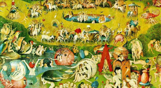
Hieronymous Bosch, Garden of Earthly delights, detail; Above, Bosch, The Last Judgement, detail. The original and best Christian Theme Park paintings!

Hieronymous Bosch, Garden of Earthly delights, detail; Above, Bosch, The Last Judgement, detail. The original and best Christian Theme Park paintings!

Digesting the Visual World

Many years ago, when I first proposed a class on generating imagery, everyone kept asking me, “Can you actually teach that?”  I’ve taught “What to Paint: Digesting the Visual World” six or seven times now, it turned out quite popular and successful and I still don’t know the answer to that question. I’ve revamped it a bit and reconfigured it as a two-day workshop, “Imagery: Digesting the Visual World” (love that gastronomic metaphor) at the Kirkland Arts Center August 16th and 17th.

There are, for good or ill, numerous opportunities to take classes or read books on “unlocking your inner artist”, “unleashing your creative forces”, “getting in touch with your inner Van Gogh/Matisse/fingerpaint-wielding five-year old”, etc.– by now you’ve probably figured out where I stand on the good/ill thing– but I think there is a way to approach the problem intellectually, or at least like an adult. The problem, defined more or less as that of a painter who has acquired some measure of technique and not being sure what to do with it, is peculiar to our affluent urban society replete with opportunities for people to study art (which is one of the best uses of affluence I can think of). It’s further complicated by an artistic zeitgeist where the prevailing winds seem to whisper that everything’s already been said and that pesky problem of the image glut.

In spite of those potential sources of severe angst, it’s actually a lot of fun for me to meet and work with artists at that juncture in their development. Not being sure “what to paint” is not the same as not having anything to say. It’s more of a translation problem: how to take what’s already floating around in your brain and what you see around you and turn it into paintings or drawings that work on a purely visual, formal level. Easy, peasy!

Art history provides a guide, and a framing device for the class, although not necessarily chronological: Stealing from the masters is one jumping-off point, as is the Pop artists’ appropriation of mass media (which has gained an awful lot of mass since their time). There are the games the Surrealists used to tap into the collective unconsciousness and whatnot, and I also throw in some more formal problems, like composing within a given format: Rules, scorned by the woo-woo crowd, can be used to take one’s mind off the imagery itself so the good stuff can seep in around the edges. Some past student work follows.

Brad Pugh did a series that came out of old baseball cards.

Brad Pugh did a series that came out of old baseball cards.

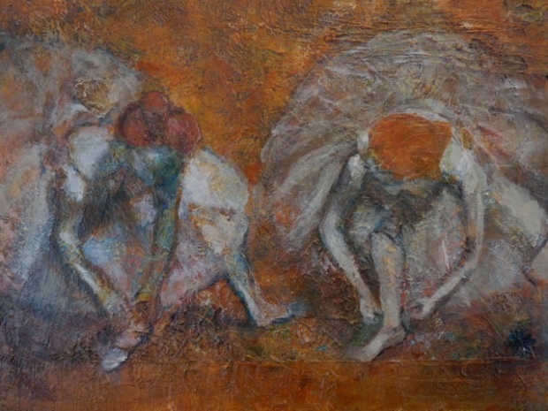
Degas dancers re-composed with a new color scheme and a heavy underlying texture. (Terry Mayberg)

Degas dancers re-composed with a new color scheme and a heavy underlying texture. (Terry Mayberg)

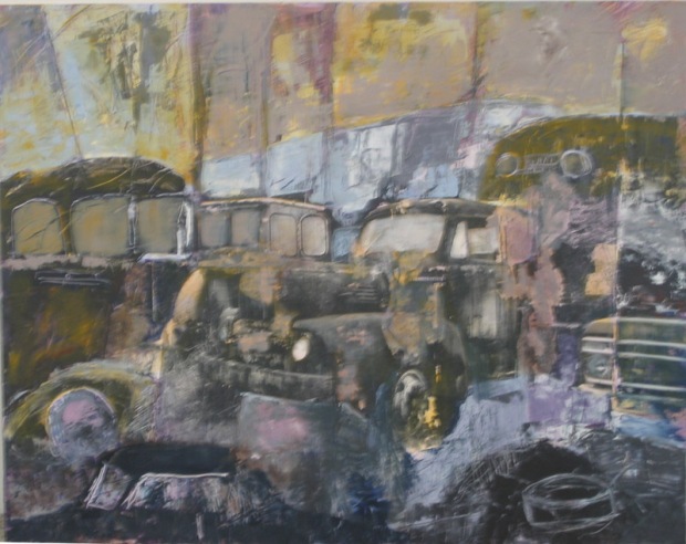
Pop imagery cut and pasted: in this painting, Ethne Vik used a collage as a starting-off point.

Pop imagery cut and pasted: in this painting, Ethne Vik used a collage as a starting-off point.

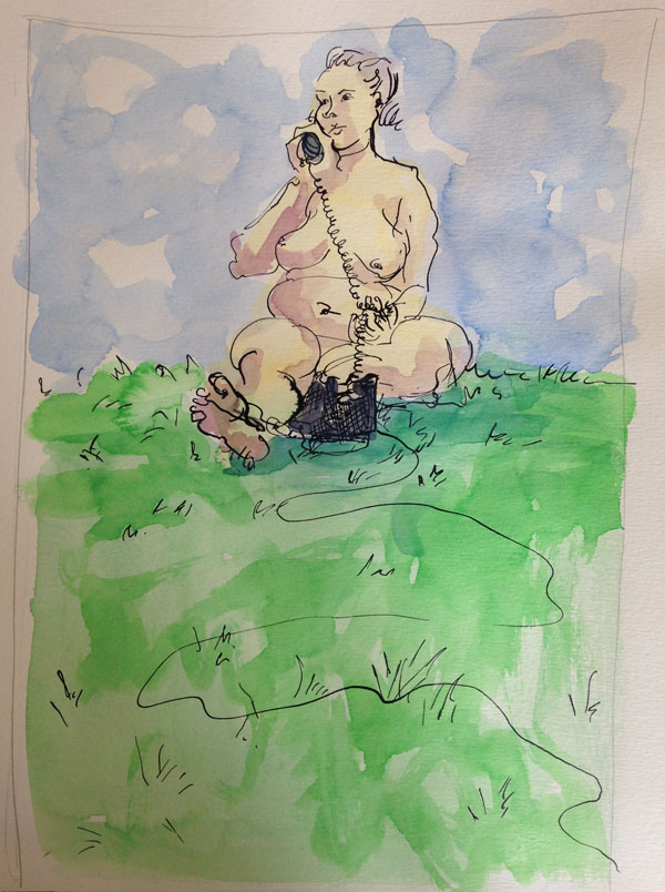
In my own development, I think I started with a strong notion of what I wanted to do and then I set about finding the technique to make it happen. (How I go about it these days is detailed on my website.) However, part of the reason I like to do quick drawings from life in addition to my “real” (studio) paintings is that it can be a more spontaneous, less fraught way of making images, and some of that spontaneity finds its way back into the studio. For instance, a photographer who moved out from a neighboring studio once left some fake grass behind. I put it on the stand in a life drawing session, the model picked up an old phone as a prop, and then I before I knew it I had a story of sorts:

realworld3

Location, Location, Location

I first offered “Drawing on Location” through Pratt Fine Arts Center three summers ago. A couple of things inspired me to create this class: One was the frustration I had experienced, as a seasoned figurative drawer and painter, upon confronting a beautiful or interesting scene “in the wild” and being utterly unable to make a decent drawing from it. I accumulated expensive watercolor sketchbooks with one half-done abandoned drawing in each, sketchbooks that had seen the world but not much in the way of drawing implements.

Then I happened upon an article in Harpers in 2005, an interview with David Hockney. It was shortly after his “controversial” book about the Old Bastards’ use of the camera obscura, and he was frustrated that his analysis was being sensationalized as an expose of the great artists’ cheatin’ ways. His point was about how we see and draw, and the difference. Even before the camera was invented, its version of reality has influenced the way we see, and how we frame and interpret what we see. Like the limited worldview of a photograph, the system of perspective developed by Alberti & Brunelleschi is analogous to the experience of vision only if you happen to be an immobilized cyclops wearing one of those collars you put on your pet after an operation so they don’t lick themselves. What you see when you climb up to the top of Chaco Canyon or the Smith Tower or just sit people-watching at a sidewalk cafe is completely different, and more complicated and confusing. Which is why many attempts to capture that experience in a photograph, let alone a drawing, are so disappointing. A big gap, and a lot of hard work, lie between lapping up the visual gorgeosity 0f the world and drawing even a reasonably interesting picture of it.

Once I figured out that, duh, I’m frustrated trying to draw on vacation because it’s hard (and I’m drinking a beer in the sun), something clicked. I realized there was an entire skill set involved in perceiving space that I didn’t tap into when figure drawing or working from flat source material. I’m looking at something as a moveable creature with binocular vision and interpreting that experience in a tiny flat two-dimensional rectangle. All that perspective I’d learned in school was still useful, but applying it to something observed in three dimensions is different from making up entire spatial realities out of whole cloth and photographs, which is what I do in my paintings.

I’ve sifted out these musings into some concrete, teachable skills that I impart in a compact four-week class where we lap up the visual feast that is our own backyard, and make a bunch of drawings out of it. It starts this Thursday.

So now I pack that adorable expensive watercolor sketchbook without the attendant guilt, knowing I’m actually going to use it in Baja. Even while the pressing activities of lolling around the beach and sipping the local tequila compete for my attention.

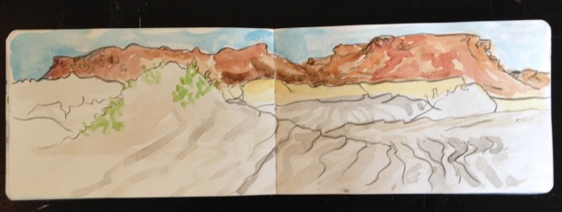
Painted near San Juanico in Baja California, just as the wind was kicking up, this sketch has the added autheniticity of actual sand added to it.

Painted near San Juanico in Baja California, just as the wind was kicking up, this sketch has the added autheniticity of actual sand added to it.

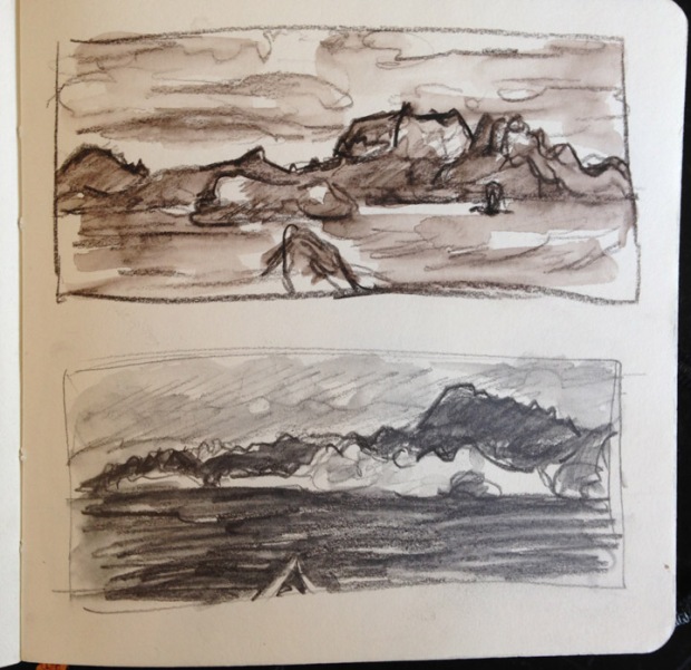
Some thumbnail sketches of Isla Danzante

Some thumbnail sketches of Isla Danzante

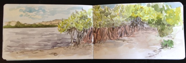
Mangroves near Bahia Magdalena, in watercolor and pencil

Mangroves near Bahia Magdalena, in watercolor and pencil

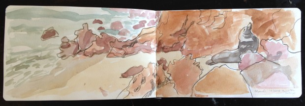
Occasionally one lucks out and a sea lion agrees to pose.

Occasionally one lucks out and a sea lion agrees to pose.

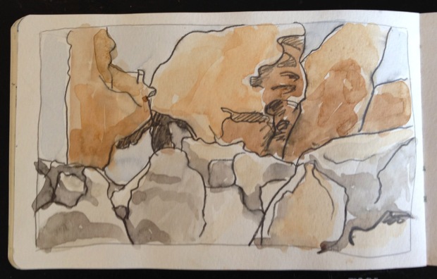
The boulder fields of Cataviña look like the backlot where the Road Runner cartoons were shot. This is one feeble attempt at them. They deserve their own painting excursion. Someday.

The boulder fields of Cataviña look like the backlot where the Road Runner cartoons were shot. This is one feeble attempt at them. They deserve their own painting excursion. Someday.


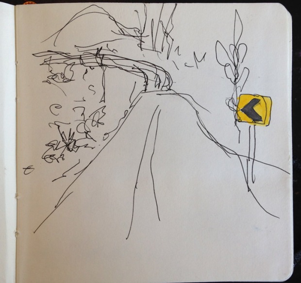
To prove my utter dedication to the art of drawing in uncontrolled circumstances, I drew this one in a moving car on a windy two-lane road. (I was NOT driving)

To prove my utter dedication to the art of drawing in uncontrolled circumstances, I drew this one in a moving car on a windy two-lane road. (I was NOT driving)

Exquisite Corpse

A drawing done as a collaboration becomes something bigger than the sum of its parts once you put all those parts together. In this exercise, I assigned each of four students a section of the figure and assigned them a scale (1 head=9 inches). They each worked on their own drawing from life, standing side by side in front of the model. A little bit of stretching out was inevitable, since the point of view shifted slightly down the row, but I think that adds a subtle Cubist touch.

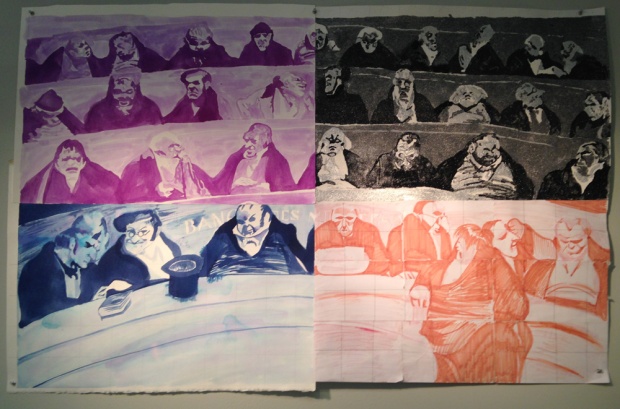
Master copies make great collaborative exercises, too. It’s like you’re adding another collaborator, a REALLY good one, and upping the game a bit. This is Honore Daumier‘s lithograph, “L’association mensuelle” covered by four students last year. The upper right portion is entirely made of glitter.

bankers

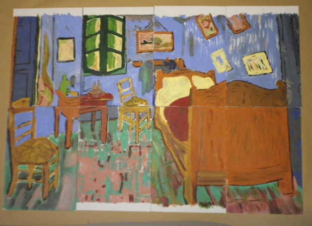
A few years ago I worked as the visual arts coach for ACT Theatre‘s production of the Pitmen Painters. Immediately following the first reading, the actors donned aprons and were thrown directly into painting, just like their coal miner characters in the story. Since the real-life miners had a fondness for Van Gogh (he had lived in mining towns and also shared some of the miners’ provincial spirit, in a good way), I chose Vincent’s Bedroom at Arles. I distributed color printouts of sections of the painting to each actor, taught them to use a grid to copy their bit onto a canvas board, gave them some brushes and previously-mixed acrylic paints and let ’em have at it. The result was actually quite respectable, especially when you consider it was done in about an hour and a half:

vangoghbypitmenactors

Color Schemes

matisseboth

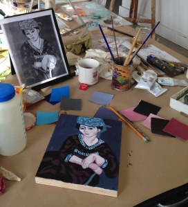
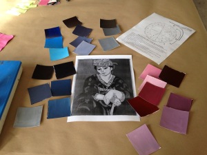
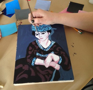
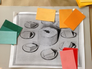
For our Color Boot Camp final project, each student picked a black-and-white reproduction of a masterwork and imposed their own color scheme on it, repainting the image in the same values with new colors.  Anne chose an analogous color scheme for this Matisse: Red violet, violet, and blue-violet, adjacent colors on the color wheel. The swatches we’d made earlier came in handy for everyone to see what they had to work with:

matiseepalette

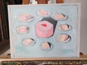
The rules were that you had to use one of your previously mixed limited palettes, match the light-dark relationships on the original, and confine yourself to one of three standard color schemes: complementary (e.g., red & green & whatever neutrals you can mix from those two), split complementary (e.g., red, blue-green, yellow-green, and mixed neutrals), or analogous (see above)

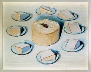
Another student covered Wayne Thiebaud, using a split-complementary scheme of green, red-orange, and yellow-orange:

thiebaudpalette

No one was allowed to look at colored pictures of the original until they were done.

Here’s her version of  “Around the Cake” with Wayne’s own on the right:

thiebaudcoverthiebaudAroundthecake

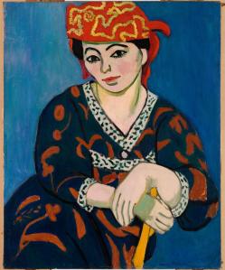
And below left,  Matisse by Anne, and right, Matisse by Matisse. Matisse showed uncharacteristic restraint with his triadic scheme of the three primaries.

matissefinshedmatisse11

In many of his later paintings, one can only classify the color scheme as “All of Them.” (We’ll try that one in Color Boot Camp III perhaps.)

Red Robe and Violet Tulips, 1937

Red Robe and Violet Tulips, 1937

Colored shadows

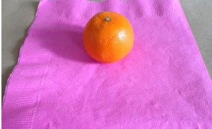
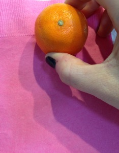
Today in Color Boot Camp class we took a look at the colors of shadows, how the colors of cast shadows are influenced the color of the object casting the shadow, and more dramatically, the light source. Here is a mandarin orange on a pink paper napkin sitting on the table, with light coming from the windows (south windows, but this is Seattle in the winter so the light is pretty much cool from all directions):

daylightorange

The same orange on the same napkin held against the wall, with halogen lights coming from above:

halogenorange

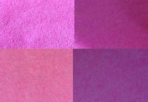
I grabbed the pinks of the napkin from the photos and placed them side by side. The top pair are the cool light area and warm shadow of the napkin in daylight (warm light from other light sources in the room is hitting the shadow –and it’s hitting the  dark side of the orange, too making it glow red)

The second pair are the warm light pink and cool bluish shadow of the napkin under halogen light.

fourpinks

Maybe just painters find this stuff fascinating (and useful) now, but in the eighteenth century, when people presumably wasted far less time on cat videos, Abbe Millot, a former Jesuit and the grand vicar of Lyon, in a personal letter to a friend (remember those?), wrote a lengthy, extremely well-observed, highly detailed description of the shadows in his room cast by two different windows at various times of day.  Some details sound right out of a Thiebaud painting: “a strongly coloured sort of penumbra…a double blue border on one side, and a green or red or yellow one on the other.”

This is quoted in Shadows and Enlightenment, a book about the eighteenth-century preoccupation with shadow (Millot apparently wasn’t alone in his obsession), by the late great Michael Baxandall.

Color Boot Camp

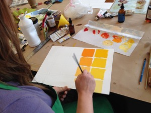
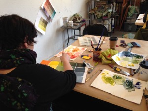
Color Boot Camp, which started in January, is in its final weeks. We’ve had a fabulous session with a group of six excellent painters. Choosing just three pure pigments that fall into the red, blue, and yellow categories, each student mixed a full palette of secondaries, tertiaries, tints, and tones, 81 colors from just 3 colors and white, ending up with a set of useful reference swatches.

jennyorange annemixing

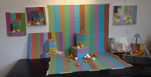
We used that palette to paint this still life, paying particular attention to the colors of the shadows, and how to interpret and make sense of its weird colors with the palette you have. Everyone’s palette was slightly different, since they’re each mixed from different primaries, but each palette has an internal cohesiveness to it, lending harmony to the paintings.

stilllife

Then we ate it.  (The eggs were hard-boiled)